Tuesday, November 22, 2011

Small Business Saturday Details!

Time to get in the mood for some holiday shopping with our Small Business Saturday Sale.  If you are interested in taking advantage of this sale, be sure to send an email to preppypaperie@gmail.com to start your custom quote in order to have you ordering link all ready by Saturday. 

Happy Holiday Shopping!

Saturday, November 12, 2011

It's beginning to look alot like...

CHRISTMAS!  I have been designing this year's holiday cards since August (no joke!).  These lucky ones made the final cut!  These very simple looking cards will add instant elegance to your holiday photos.  Everything is for purchase at: www.preppypaperie.com/preppy-holiday/

And remember, the holidays sneak up on you.  So make sure you purchase at least 3 weeks before you'd like to stick them in the mail.  Happy holidays!


(Kudos to the amazingly talented Lisa Dierolf Photography for some amazing shots.  Check her work out at www.lisadierolfphotography.com)

Wednesday, November 2, 2011

More Nautical Love

Jenny contacted me this fall after finding me on  Facebook.  Her and her fiance loved one of the first invitations sets I sold on Etsy! I was excited to recreate the suite and add some new elements. They wanted a few enclosures as well as matching Save the Dates for their spring nuptials.

I first designed the Save the Dates.  I wanted to highlight main design elements from the invitations as well as making it distinct enough to stand out as a separate piece of stationery.  I paired these with matching envelopes that contained the same dotted line as the invitation.


Once I completed the Save the Date, I started to re-design the invitation and the fun enclosures. The invitation remained similar to the one designed last year, but this time I paired it to a matching envelope the picked up the stripes from the RSVP card.


I try to shy away enclosures that are too match-y.  Mixing up portions of wedding suites gives depth to the entire package.  


I love creating RSVP postcards! And they are a real cost savings to a bride (especially when mailing!).

Sunday, October 23, 2011

Winter Elegance

It's beginning to look a lot like WINTER! Well, in stationery that is.  Have you noticed the influx of gorgeously styled winter wedding shoots in the bridal magazines and blogs?  These weddings are truly unique in the fact they can capitalize on the stunning landscape of the season.  All winter weddings typically have one thing in common, the feeling of warm elegance.

So when Brooke and Keith got in touch with me to design their winter wedding invitations, I was overjoyed with the opportunity to design for this season. Brooke and Keith wanted a simple color palette of cream and black with a hint of cranberry.  They plan to exchange nuptials overlooking the Annapolis waterfront in the cosy ambiance of the Yacht Club.  To compliment their simple color palette, I wanted to go with a simple invitation that focused strongly on typography and texture.  Burges Script is such a beautiful font that it cannot be upstaged with a lot of graphics.  So I thought it would be the perfect focal point for their invitations. I wanted to give the invitations a bit of color depth as well.  I incorporated the hint of cranberry in the simple border.


To feed my addiction to my cream felt paper, I decided to use the luxe paper throughout the suite.


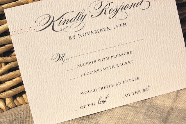
To have a little fun in the very elegant and formal invitations, I played with entree choice wording of the RSVPs.


Brooke and Keith have had all of their major relationship milestones in Annapolis. When I designed the map enclosure, Brooke asked if we could place their milestones around the map to give their guests a bit of history. I loved the idea and it came out beautifully.


I wanted the invitation to feel warm when Brooke and Keith's guests opened them.  Wrapping them in my kraft twine accomplished that effect.


I am now feverishly designing reception details for Brooke and Keith. I will be sharing those after the big day!

Tuesday, September 27, 2011

Merry-ment Down Under

This summer, Lainie contacted me all the way from Australia to design her invitations based on my Merry Monogram suite.  Lainie already had her monogram designed by someone else and just wanted it incorporated into the suite.

Based on the details Lainie provided about the wedding, I decided to print the set on my new luxe white felt paper to provide some warmth with texture. We decided to use kraft envelopes sealed with custom address wrappers to match the suite.  To finish it off, I used brown twine to tie custom tags with the couples name around the invitation suite.


She is also planning a sweet (ha) dessert bar for her brunch reception. So we designed matching tags for all the desserts. I love the bright and cheery color scheme of this invitation.  Reminds me that soon I'll be gearing up for all my spring brides!

Sunday, September 18, 2011

Save the Date Cartography

The engagement set the stage for Lisa and Mike's coastal inspired nuptials for next September. In May, Mike dropped down on one knee while sailing the Chesapeake with Lisa.  I was impressed that neither of them dropped the ring in the excitement!

I met with the couple in early August to discuss Save the Date cards.  When I sat down, Lisa, who is an avid sailor, immediately handed me the nautical coordinate's for their wedding's venue.  I knew then that this was going to be a really neat project.  Lisa and Mike are envisioning a coastal themed wedding chock full of buoys and nautical charts. They wanted an antique nautical map of the Chesapeake to set the stage in their Save the Dates.

I always do plenty of research for my custom designs, however, rarely do I log onto NOAA (National Oceanic and Atmospheric Association) for design help.  NOAA houses an up to date library with all current US nautical charts.  I studied the cartography patterns for the Annapolis area and immediately got to work sketching.  Believe it or not, there is a fine line between an antique map and a pirate treasure map.  I was really avoiding the latter.


Font selection was key! I always love using Campbell in anything nautical.  And the incorporation of Burges Script really sets the stage for an elegant affair.  I decided to print on my new 110lb felt ecru to give the save the date a luxe and vintage feel.


In the end, I love how these came out. I hope the many out of town guests that Mike and Lisa have invited will be as excited to share in the coastal affair!


Thursday, September 15, 2011

JCrew Inspired Designs

One of my favorite parts of designing wedding stationery is when a bride comes to me with a design image and wants the idea carried through in their invitation.

Last May, Stephanie contacted me about creating a rehearsal dinner that mixed my "Lovie Lobster" invitation with the style of this JCrew ad:

I loved the antique look of this and the soft color scheme.  So I started with that.  Stephanie was thinking about incorporating a few nautical touches- crabs, anchor, lobsters, ect. One of the original designs was this one.  


So I went to work.  I think Stephanie and I hammered out about 15+ ideas and color schemes.  In the end, it came out very similar to the Lobster invitation.  I do love the typography we incorporated as well as the various shades of orange in the anchors. As I have found out, great designs often get reused and tweaked!
Custom Invitations with Matching Address Wrappers

Next up on the blog:  Save the Date Cartography

Thursday, September 1, 2011

Notecards Galore!

The Paperie has been slammed lately with a ton of fun and diverse projects.  In about a week, I received about 10 notecard orders.  It was a welcome change from the height of wedding season!

Designing stationery and notecards is a unique challenge.  When you send that special piece of correspondence usually to say "thank you", the stationery itself is as important as the note inside.  I work for hours on end (early Saturday mornings usually bring the most creativity) designing cards that are unique to each person.  

In the coming weeks, I hope to stock pile more notecard designs on the Etsy site. Most of the designs I plan on re-listing are ones that were custom made for clients.  So if nothing sparks your interest on the Etsy site, have no fear, Preppy Paperie will be able to design it! 

Here is a peak at some of our recent custom designs!


I liked this one so much, I made myself one!


Next Week on the blog: Jcrew inspired design

Saturday, August 13, 2011

Lobsters and Stilettos

When Laura came to me to design her beach wedding invitations, one of the design inspirations were these watermelon stilettos. I absolutely loved the navy and watermelon color pallette. I felt like I was in preppy heaven!  

In designing for this beach themed wedding with a Coastal Mid-Atlantic venue, we incorporated watermelon colored "lovie" lobsters with a thick navy border.  I brought the watermelon color forward with a contrasting RSVP card.  To tie the suite together, we used matching navy envelope liners with a striped skinny labels on the mailing envelopes. The suite turned out beautifully, just as we hope Brian & Laura's perfect day does!


Laura's completed suite


 Invitation with matching envelope  


Contrasting RSVP Card with Matching Printed Envelope


Packaged up and ready to go!


Up next: Notecards Galore!

Tuesday, August 9, 2011

Woah..

I've been waiting to post another entry on my blog for one major reason..I am a bad secret-keeper.  You see, about a month ago I received a strange email.  It went something like this:

Hi Ashley, this is Kim from the Washingtonian Magazine.  We'd love to feature the Preppy Paperie in an upcoming article.

My response was something like this:

HA! Which one of my practical jokester friends put you up to this?

I know Washingtonian Magazine pretty well. So well in fact that I used it to find most of my own wedding vendors.

So I was beyond thrilled when I found out this was a for-real deal.  I really tried to tell no one just in case I royally bombed the interview and the Washingtonian wanted nothing to do with the Preppy Paperie. I figured if I even started typing a blog entry, the word "Washingtonian" would magically make its way to cyberspace.

Today I received word that I was officially featured.  I'm pretty sure I had a sailor's mouth (for excitement, not anger) for a good 20 minutes.  So here is it.  I hope you learn a little bit about me and the Preppy Paperie!


Coming up next week on the blog:  Watermelon Stilettos and Lobsters


Saturday, July 16, 2011

Watch out blogosphere, we've arrived!

My to-do list is always growing.  Usually it grows so long that the first few pages are riddled with coffee cup stains and torn edges.  At this point, I rip off a new sheet of paper and re-write the list (purely for aesthetic reasons).  Occasionally, I even put tasks I have already accomplished so I can physically cross the task off again and feel even more productive. Yes, I know how pathetic that sounds. My weekly list contains a list of proofs to be sent, shipments to be set up, stock orders, Etsy updates, Facebook updates, yada-yada-yada. One item that has been on this list for quite sometime- "Create a Blog".  I've been a writer for sometime, so this should be natural. Ha. I'll let you be the judge of that.

"Create a Blog" never left my list because I knew that I needed another outlet to share where the Preppy Paperie gets inspiration.  I will also be sharing all the paper thats in process in our "studio". Since this is still a part-time operation, our "studio" consists of the front office of my house.  Much to the displeasure of a 3 1/2 year old golden retriever who previously occupied the space. 


I hope I keep your interest enough to follow the blog and maybe take a peak at the store (www.etsy.com/shop/preppypaperie).  I look forward to sharing my paper inspirations!