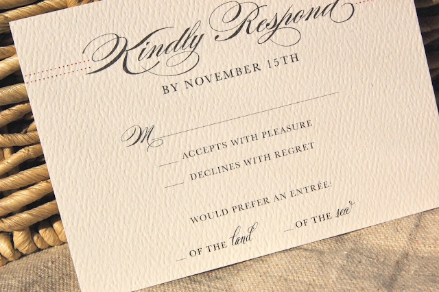
So when Brooke and Keith got in touch with me to design their winter wedding invitations, I was overjoyed with the opportunity to design for this season. Brooke and Keith wanted a simple color palette of cream and black with a hint of cranberry. They plan to exchange nuptials overlooking the Annapolis waterfront in the cosy ambiance of the Yacht Club. To compliment their simple color palette, I wanted to go with a simple invitation that focused strongly on typography and texture. Burges Script is such a beautiful font that it cannot be upstaged with a lot of graphics. So I thought it would be the perfect focal point for their invitations. I wanted to give the invitations a bit of color depth as well. I incorporated the hint of cranberry in the simple border.
To feed my addiction to my cream felt paper, I decided to use the luxe paper throughout the suite.

To have a little fun in the very elegant and formal invitations, I played with entree choice wording of the RSVPs.


I wanted the invitation to feel warm when Brooke and Keith's guests opened them. Wrapping them in my kraft twine accomplished that effect.

I am now feverishly designing reception details for Brooke and Keith. I will be sharing those after the big day!


No comments:
Post a Comment